Our visual identity has evolved to remain a reflection of our services.
Since our foundation in 1972, Markey has grown from serving the insurance needs of a small group of clients within the Newcastle and Hunter Region to become one of the largest locally owned and managed insurance brokerages in Australia. Over this time the Markey brand has evolved to ensure it remains a reflection of our services and commitment to our customers.
There has never been a more exciting time to be a Markey customer, with our diverse service range and access to technology that simplifies communication between us. We wanted a visual expression to reflect where we are now and what we represent to each of our diverse range of customers.
The Markey Evolution
1969Markey's original incarnation
 Incorporated in 1969, R. D. Harrison & Company Pty. Limited was established by Robert Harrison and Trevor Markey to support the insurance needs of Newcastle and the surrounding suburbs. With the exit of Robert in 1972, the company became T.A. Markey & Co Pty Ltd and traded from the family home in Kahibah.
1972Moved premises
1985Joined Austbrokers
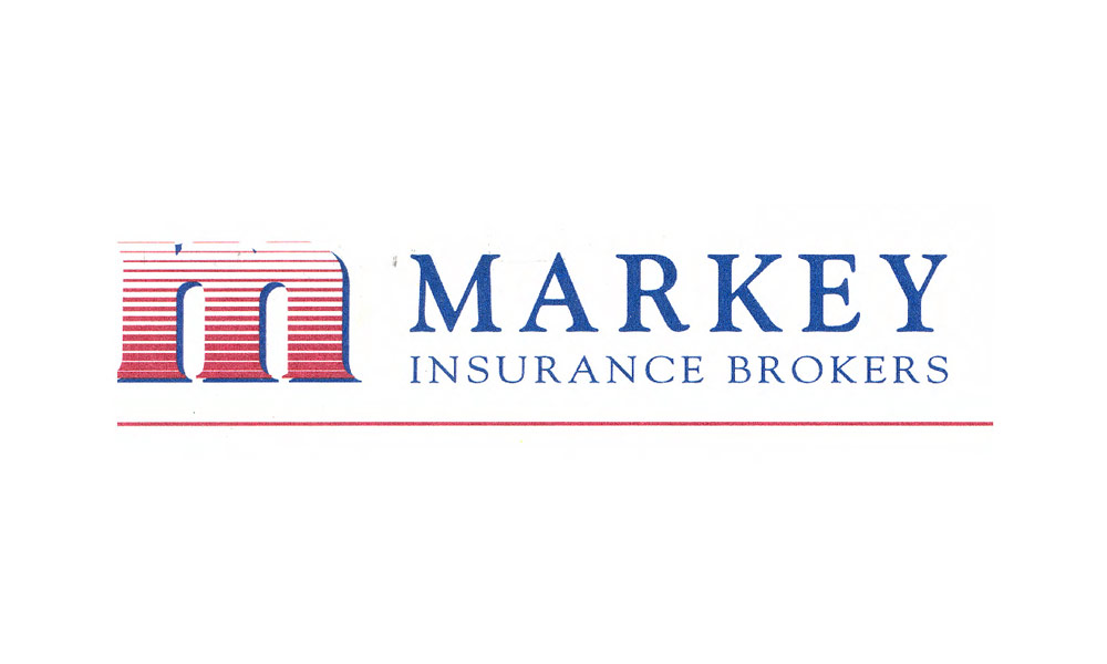
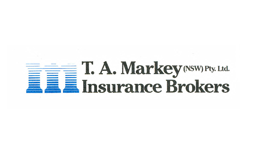 The Austbrokers Network was established in 1985 to give individual General Insurance brokers the opportunity to enjoy the benefits of a larger group. Markey joined the network and added NSW to our logo to give clarity to Markey's position in respect to other Austbrokers registered brokers. We also added a stylised "M" which was striped to avoid the problems that photocopiers and fax machines had in reproducing solid blocks of colour.
1990Aligned visually with Austbrokers
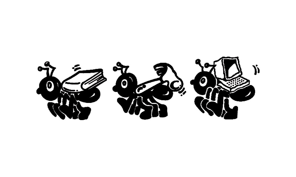
1992Adopted an ant as our icon
Early 2000'sKeeping up with Austbrokers
Early 2000'sReturn of the ant
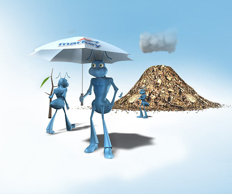
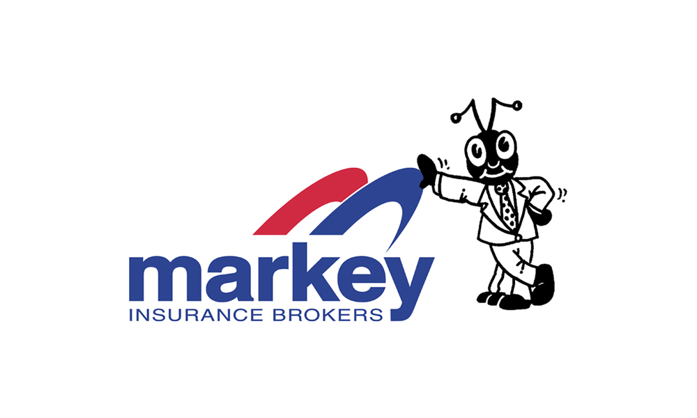 An updated visual identity required us to inform our customers of the change. Another 2 television ads were made and our ant grew up and could stand upright rather than walking on all legs. Rumour has it that the new ant was modelled on our founder Trevor Markey but never been truly clarified with the artist.
Later 2000'sA little more shine
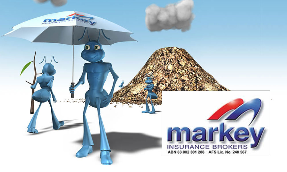 In keeping with advancements in graphic design technology, we added more depth and reflection to our logo - and gave our ant a 3d overhaul. You can watch our ants in action here.
2017A better reflection
 As part of their expansion globally, Austbrokers rebranding to AUB Group. We saw this as the pertinent time to realign our visual identity to encompass our core value of supporting you with simple and effective insurance and risk services. We've removed the "M" icon and simplified our logo, making a clean and memorable logomark that doesn't try to confuse the eye.
Tailored to you
Social signature
Ant for the digital age
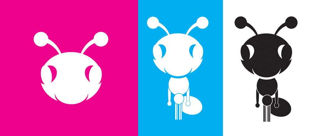 With the changing methods of communication, our ant has had a makeover to be more appropriate for 2017 and beyond. The ant still represents our values at Markey. You can read about them here.


